
Rebuilding Checkout for Faster Completion: Home Depot Canada
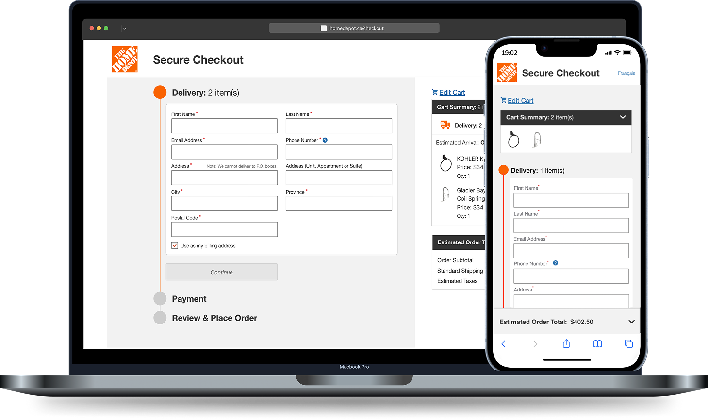
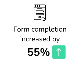
Redesigned the checkout experience by improving fulfillment options and form information hierarchy —resulting in a 47% reduction in drop-offs and 46% faster checkout completion.
IN BRIEF
The Problem
lengthy checkout experience
no fulfillment selection
friction in account creation
mobile experience overload
legacy-driven performance issues
Why do 38% of our customers drop off at checkout ?
Modernize the checkout platform by replacing legacy code, delivering a best-in-class UX that reduces abandonment and time to completion.
The Goal
Solution
01
Eliminated redundant form fields and unnecessary data requirements
02
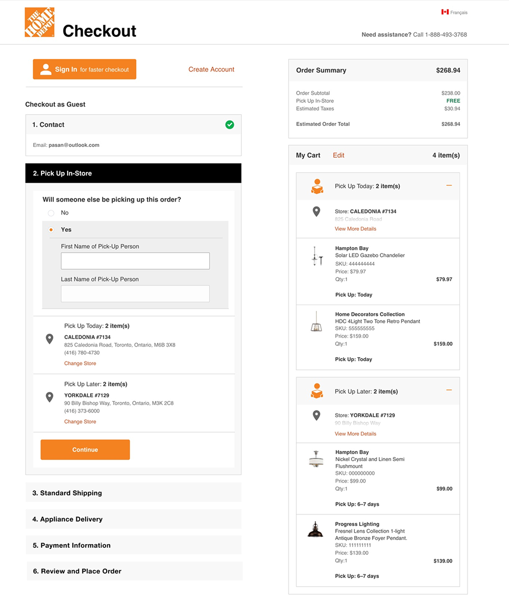
Reduced the number of fulfillment categories from 7 to 2, cutting down on complexity
03
Reduced the reasons to abandon checkout, by allowing delivery scheduling and store selection in cart
04
Enhanced the visibility of the order total and organized the summary intuitively for mobile, reducing the need for excessive scrolling
Measured Impact


THE FULL STORY
Project Goal
Modernize the checkout platform by replacing legacy code, delivering a best-in-class UX that reduces abandonment and time to completion.
Process
01 Learnings from Research
02 Concept Sketching & Test Insights
03 Scope Revisions
01
Learnings from Research
-
Through moderated interviews with 16+ users, we uncovered several key insights around:
how users reviewed information
how users felt about filling different types of forms
how users felt about making decisions
how retracting from their journey felt
-
Checkout layouts: full one-page, accordion-style, or multi-step
Simplified forms
UX trends of Store selection and pickup/delivery scheduling
Guest Vs Signed in checkout
Trends in Mobile experience
Summary of information
Best practices to making changes on checkout
-
“I wanted to change my store but I was taken back to cart”
“I wanted to create an account but I was taken off my journey”
“I’m constantly jumping around the page trying to find the info I need”
“ I was ready to buy, but the time spent on filling forms made me second guess it”
02
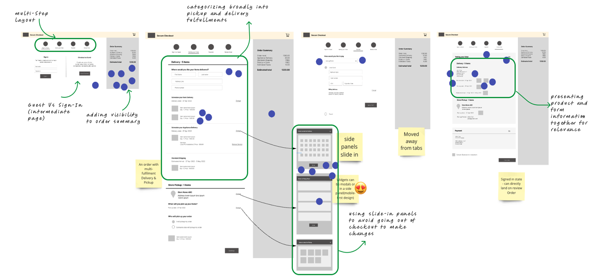
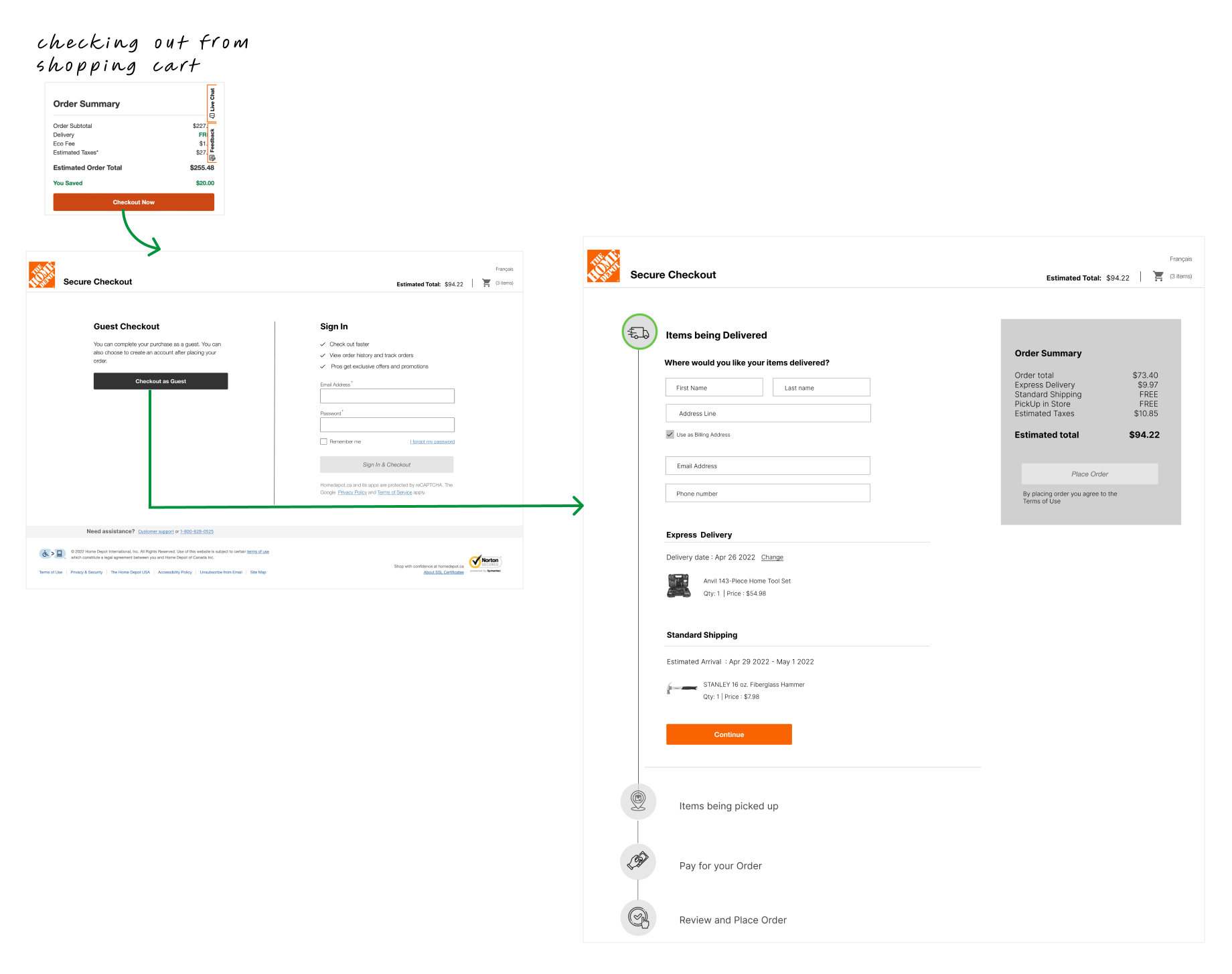
Concept Sketches
01 Intermediate Sign-in
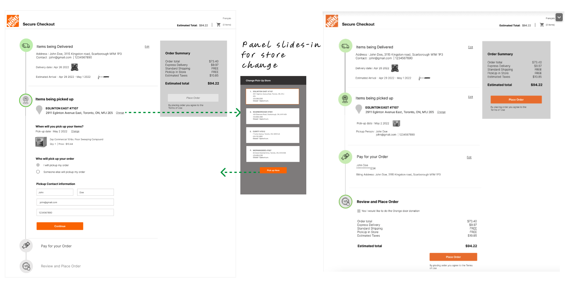
02 Delivery/Pickup
03 Absence of Cart
04 Review State
-
Intermediate Sign in Page - Users were clear on the Guest Vs Sign In journey
Simplified Fulfillments - Clear comprehension
on Pickup and DeliverySummary of Information - Users liked showing relevant products next to form
Fulfillment decisions - Users liked making time and location related fulfillment decisions at checkout
-
Cart Display required - Users preferred a unified cart view to easily confirm products and tally costs.
Users do a final review before placing order - Users expected to double check products right before placing order
-
Visual Design - To add visual design into next round of testing
Form Design - Refine form fields across the checkout
03
Scope Revisions
Information Hierarchy
How might we simplify fulfillment, streamline information capture, reduce decision-making effort, and improve transparency?
Mobile-First Problem Solving
With only 12% of purchases coming through the app (2018–2020), we focused on removing mobile friction and driving greater app adoption.
Integrate Familiar UI Patterns
Eliminate confusing fulfillment terminology and clearly communicate how and when customers will receive their products.
Prototype the Interactions
Organize content to simplify decisions, improve visual flow, and guide users with clear progress indicators.
Technical Feasibility
Minimize scrolling while maximizing visibility of essential content.
04
Design Milestones
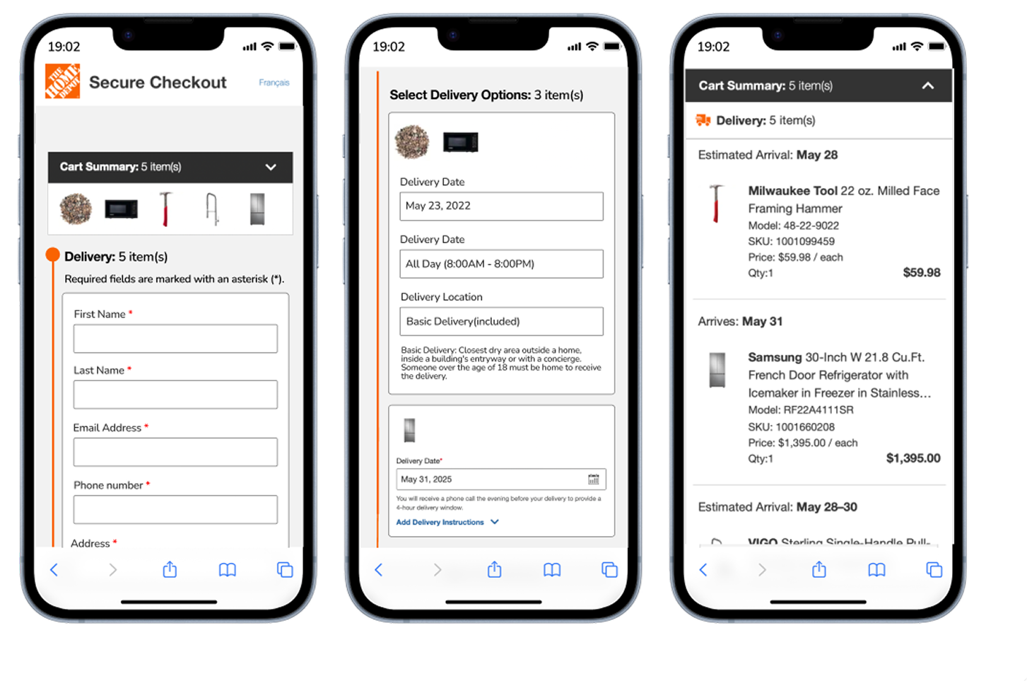
Mobile users faced excessive scrolling and fragmented information across checkout, making it difficult to review key details and contributing to abandonment.
How we solved it
We revamped the form architecture by streamlining the number of input fields, consolidating fulfillments, introducing a collapsible cart, and adding a sticky order summary
What users thought
Users found the cart intuitive, with clear product grouping by delivery date and a sticky order total for quick access to key information.
Users strongly preferred the simplified checkout experience.
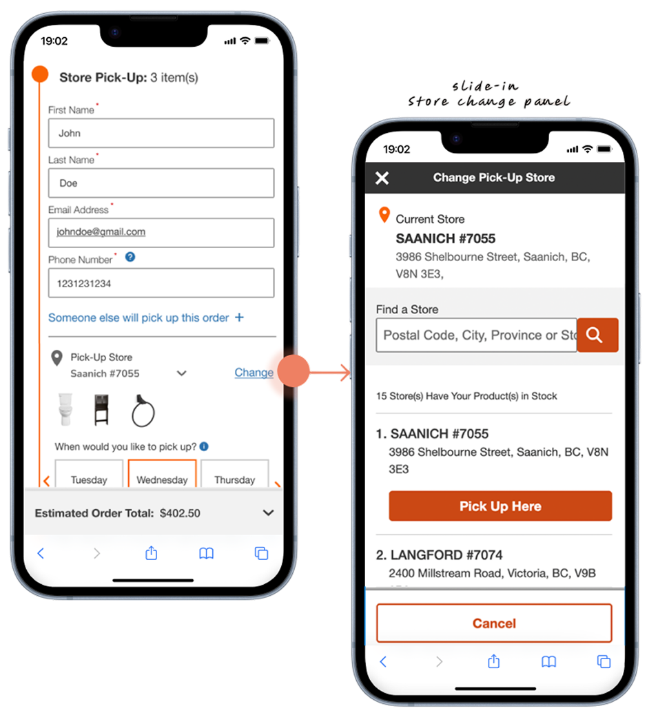
Users had to leave checkout to change their pickup store, creating friction and increasing abandonment.
How we solved it
We repurposed the slide-in panel component to showcase nearby stores, including their addresses, that have the product in stock. Users can select a new store, and the update will seamlessly reflect in the checkout process.
What users thought
Intuitive, flexible store selection across desktop and mobile, with clear alternatives and an accessible date picker.
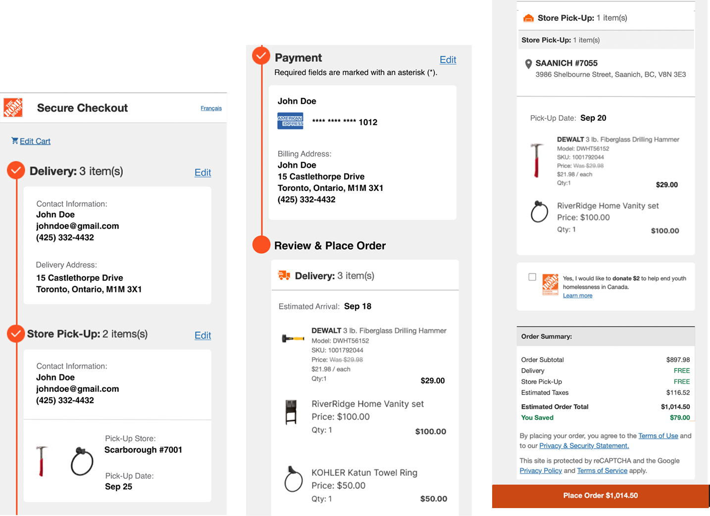
Clear pickup summaries grouped by store and pickup date made selections easy to review.
Inconsistent fulfillment terminology across the shopping journey confused users and made it harder to understand their delivery and pickup options.
How we solved it
We simplified fulfillment by consolidating delivery options around delivery dates and merging ship-to-store with store pickup. Using clear, user-focused copy helped drive cross-team stakeholder buy-in and commitment to implementation.
What users thought
Grouping items by delivery and pickup dates, along with a date-based cart summary, improved clarity.
Minimal aesthetic was well-received.
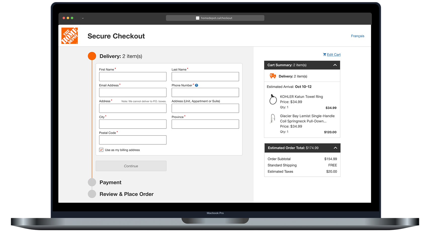
Expanded to Desktop
05
Usability Results
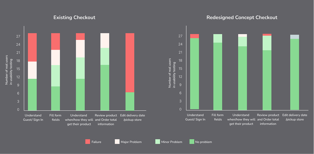
Usability test with 27 HD customers who were familiar with online shopping on other platforms.